For Clients
For Service Providers
Hong Kong (English)
Happihood Design
Branding for iGreen
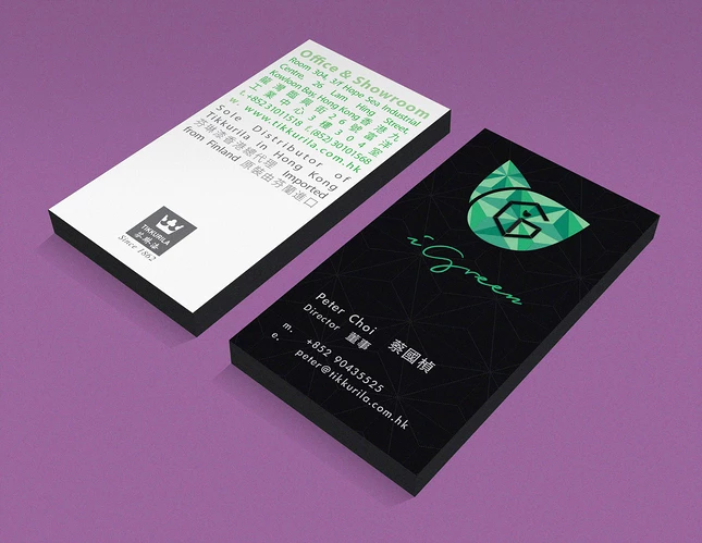
iGreen Element Limited is the sole distributor of Tikkurila paints in Hong Kong, who cares about health and the environment.
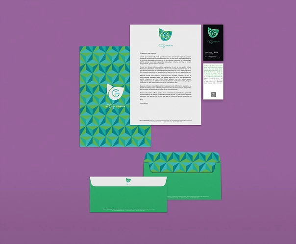
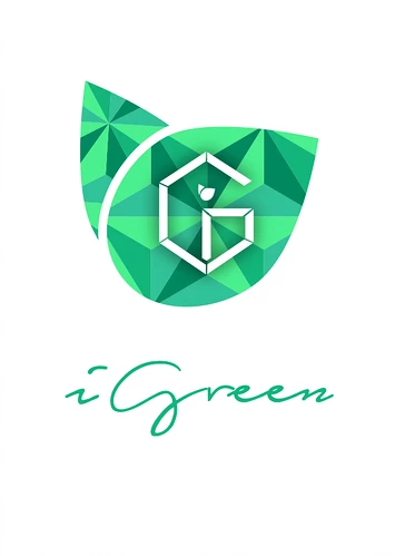
The dotted lines and angular shapes used in the logo and pattern emphasis the business nature of iGreen, supplying quality materials to interior design firms, which make a contrary with the organic shapes of the leaves, symbolizing that renovation with iGreen’s product can coexist alongside with nature. The pair of leaves, which form a heart shape, also reflects the passion of iGreen.
Project: Brand Design
Client: iGreen Element Limited
Year: 2014
Art Director: Jola Happihood
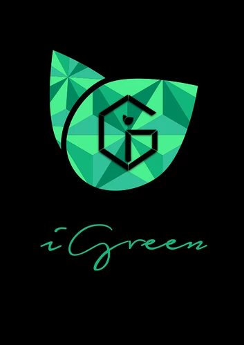
 CLIENT: iGreen
 INDUSTRY: Retail
 CLIENT SIZE: Midmarket
 STYLE:
Vector Art
STYLE:
Vector Art
 TARGET AUDIENCE:
Corporate Communications
TARGET AUDIENCE:
Corporate Communications