For Clients
For Service Providers
Singapore
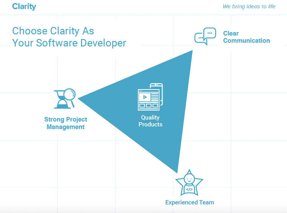
Clarity
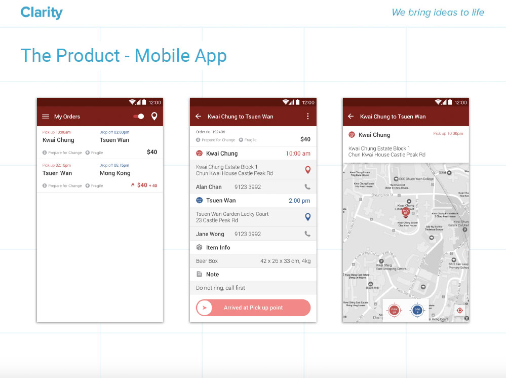
UI & UX Redesign for a Logistic Based Web & Mobile Application
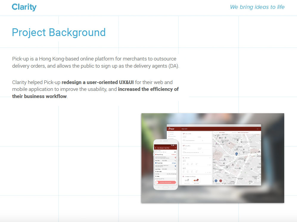
Project Background
Pick-up is a Hong Kong-based online platform for merchants to outsource delivery orders, and allows the public to sign up as the delivery agents (DA).
Clarity helped Pick-up redesign a user-oriented UX & UI for their web and mobile application to improve the usability, and increased the efficiency of their business workflow.
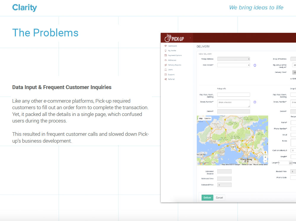
The Problems
Data Input & Frequent Customer Inquiries
Like any other e-commerce platforms, Pick-up required
customers to fill out an order form to complete the transaction.
Yet, it packed all the details in a single page, which confused
users during the process.
This resulted in frequent customer calls and slowed down Pickup’s
business development.
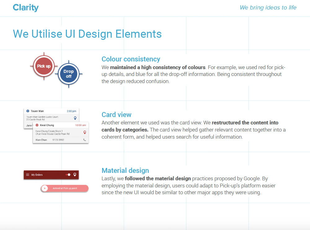
We Utilise UI Design Elements
Card view
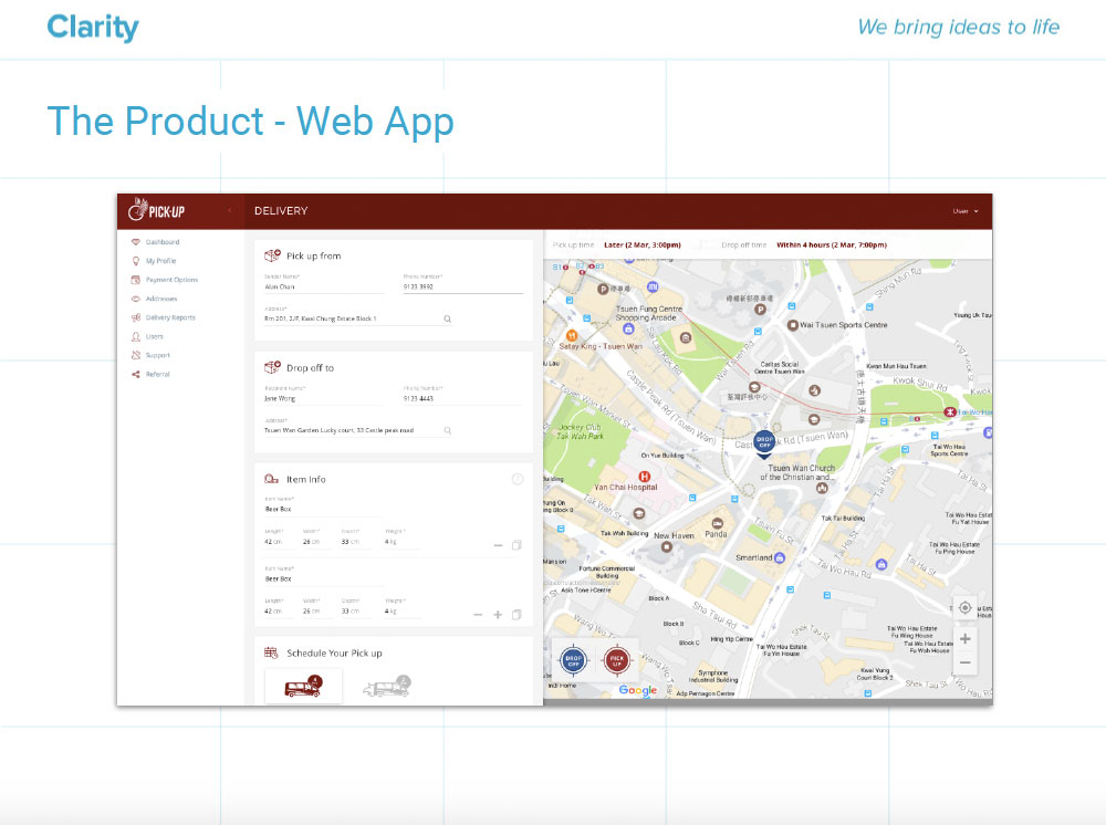
Another element we used was the card view. We restructured the content into cards by categories. The card view helped gather relevant content together into a coherent form, and helped users search for useful information.
Colour consistency
We maintained a high consistency of colours. For example, we used red for pickup details, and blue for all the drop-off information. Being consistent throughout the design reduced confusion.
Material design
Lastly, we followed the material design practices proposed by Google. By employing the material design, users could adapt to Pick-up’s platform easier since the new UI would be similar to other major apps they were using.
Pick-up is a Hong Kong-based online platform for merchants to outsource delivery orders, and allows the public to sign up as the delivery agents (DA).
Clarity helped Pick-up redesign a user-oriented UX & UI for their web and mobile application to improve the usability, and increased the efficiency of their business workflow.
The Problems
Data Input & Frequent Customer Inquiries
Like any other e-commerce platforms, Pick-up required
customers to fill out an order form to complete the transaction.
Yet, it packed all the details in a single page, which confused
users during the process.
This resulted in frequent customer calls and slowed down Pickup’s
business development.
We Utilise UI Design Elements
Card view
Another element we used was the card view. We restructured the content into cards by categories. The card view helped gather relevant content together into a coherent form, and helped users search for useful information.
Colour consistency
We maintained a high consistency of colours. For example, we used red for pickup details, and blue for all the drop-off information. Being consistent throughout the design reduced confusion.
Material design
Lastly, we followed the material design practices proposed by Google. By employing the material design, users could adapt to Pick-up’s platform easier since the new UI would be similar to other major apps they were using.
 CLIENT: Pick-Up
 INDUSTRY: Transportation
 CLIENT SIZE: Midmarket
 TARGET AUDIENCE:
B2C
, Mass Public
TARGET AUDIENCE:
B2C
, Mass Public